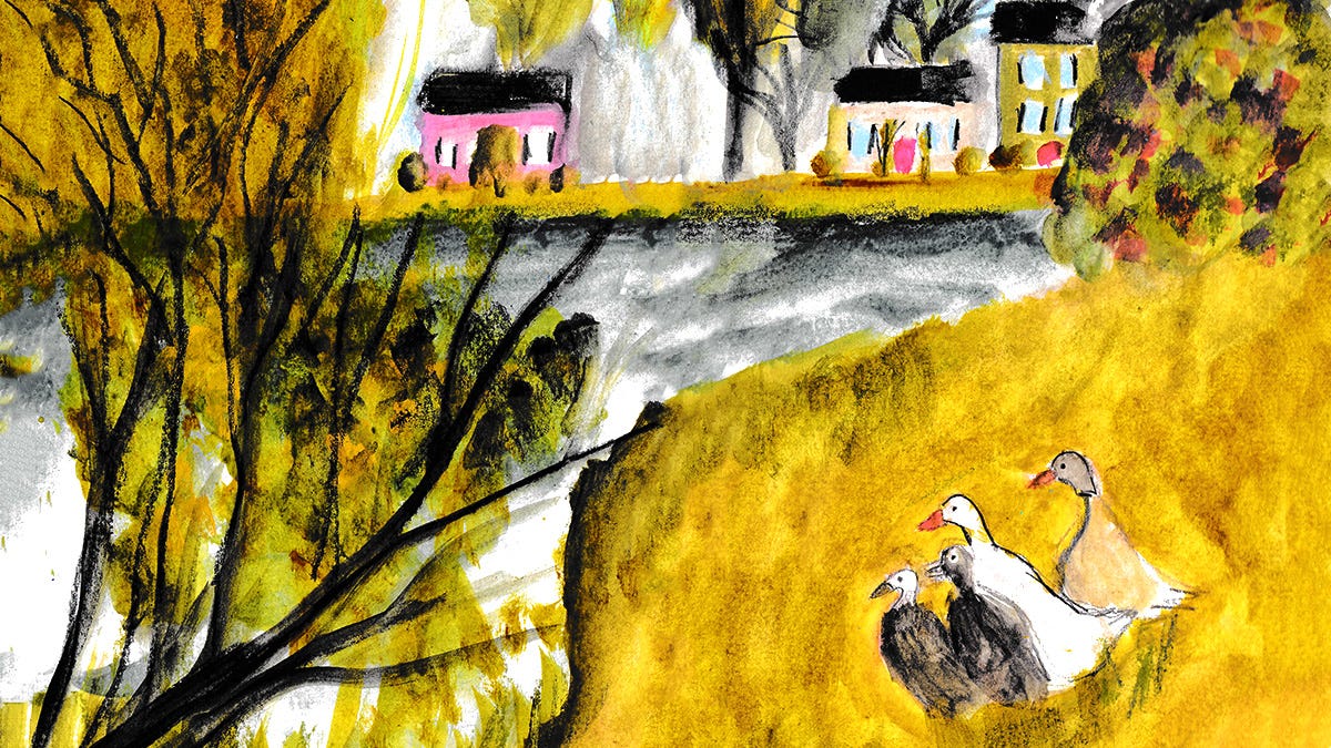
Opera is a color that grabs you by the shoulders and says “IT’S TIME TO PARTY!” It’s a sugar-coated neon color that’s so pink it’ll tickle your teeth.
It needs the support of calmer colors, like yellow ochre or warm grey, to truly shine. This gives our eyes breathing room, so we’re not blasted with electric pink!
A few facts about Opera
Scanners can’t capture it’s vibrance. You’re better off photographing your art in natural light.
You can’t mix Opera from primary colors. The closest you might get is using magenta and red, but they won't give you Opera's brilliant glow.
It’s usually not lightfast. It’ll likely fade over time, so consider that before using it for gifts or commissions.
Mixing Opera into your practice
Less is more. If you're working straight from the tube, use WAY less than you think you need.
Consider white space. Imagine if I wrote this Substack post in all caps without line breaks. It would be a nighmare to read! Our eyes need white space, and this also applies to art and illustrations.
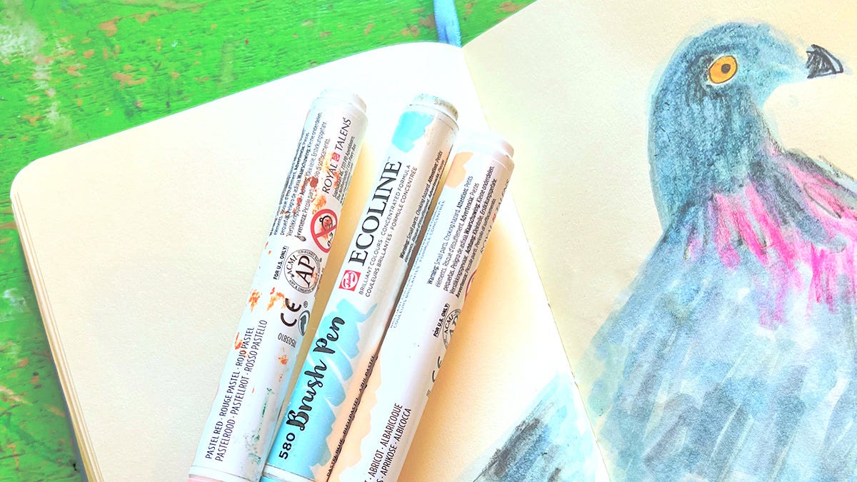
Add Opera at the very end. It's so tempting to start with the fun, punchy colors, but save those ultra-saturated pigments for the end. Start with lighter, more muted colors. You’ll be glad you did!
The Pink Session with Holly Surplice
Do you love the color pink? Or do you find it challenging to work with, like I usually do? This session is for you! Many thanks to everyone who joined and a huge shoutout to Holly Surplice for curating these incredible photos and cohosting with me!


