


I've explored a roughly a bajillion ways to add letters to my art over the years.
Some worked, others not so much. The experimentation led me to my current process. Using the magic of technology, I beam written words from paper to screen, then add them to my art. The biggest leaps in improving my letters happen before the art even hits the scanner. Since several of you asked, I’m sharing my updated, ever-evolving words-and-pictures process, along with a prompt so you can practice.
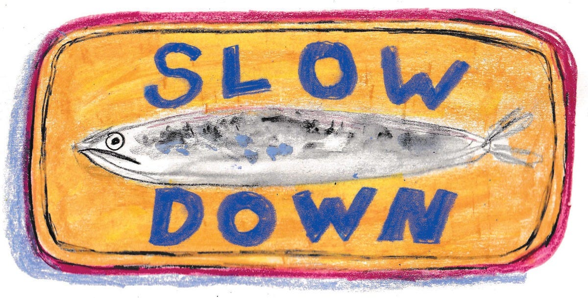
Slow down
While I love a bit of chaos in my drawing, letters need to be clear and legible. For this reason, I draw letters at 0.25x speed. This snail’s pace ensures each character is clear and readable.
Revisiting older posts, like this one, I wish I could hop into a time machine and tell Beth from the past this tip. She was writing way too fast!
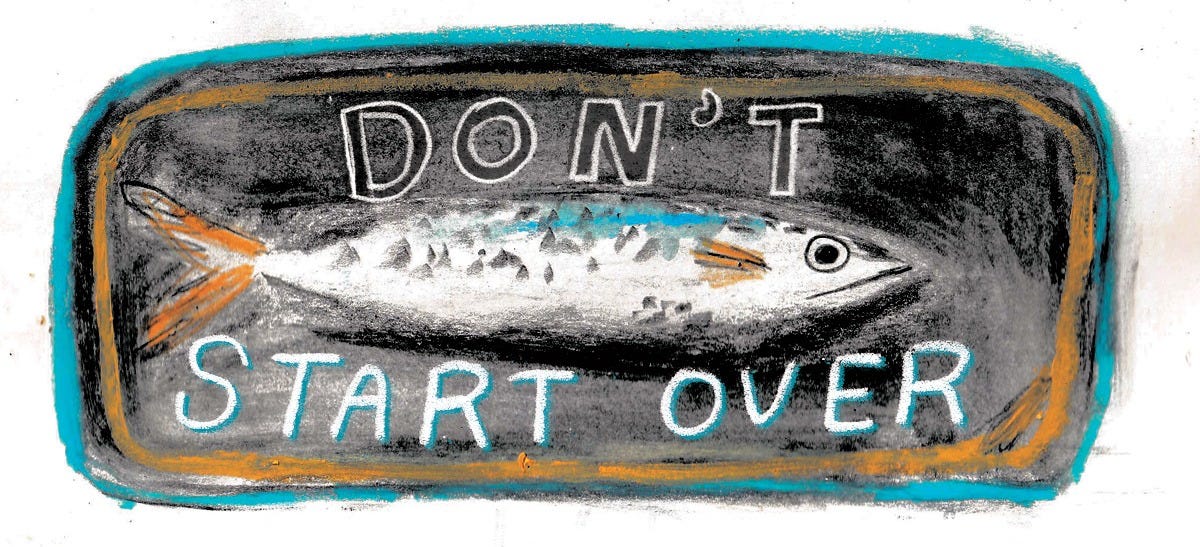
Don’t start over
Let’s say I’m in the middle of writing the word “SARDINE” and the letter D looks more like an O. It’s best to finish the word, then draw a few extra D’s that I can replace it with in Photoshop. Embrace the wonky D!
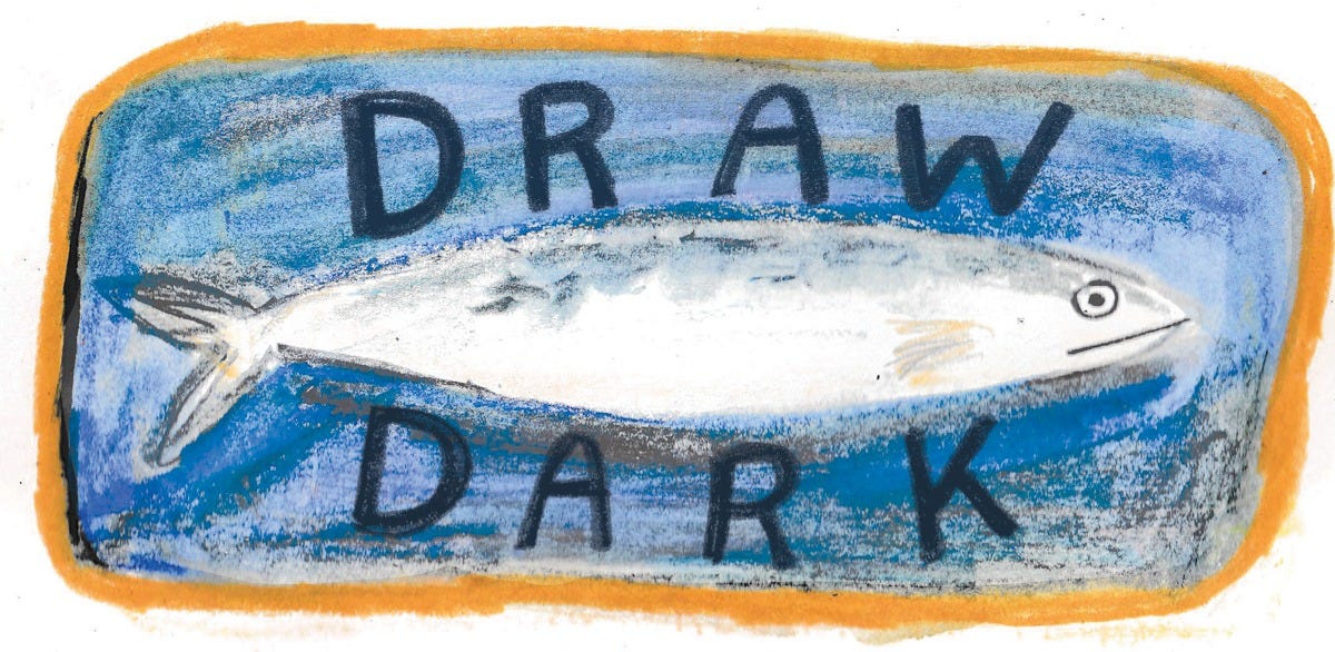
I always use a dark pencil, 6B or higher. Black ink, crayon, or colored pencil work well to create a strong contrast. I usually change the color in Photoshop, which I go into in the video at the top of this post!


