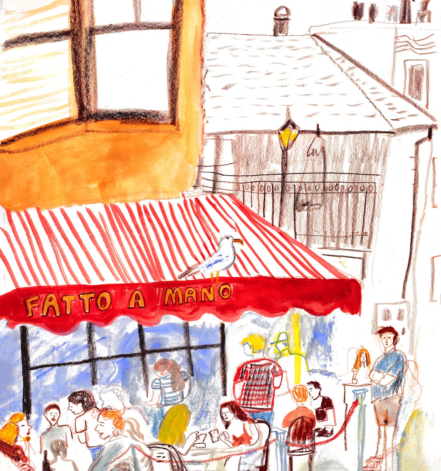
Vermillion, the warmest red primary color, demands attention. Because it’s so loud, it’s perfect color for emergency vehicles, important traffic signs, and other things we need to see from a distance.
Since I don’t only draw stop signs and fire engines, it’s usually mixed with other colors. when it shows up in my art.
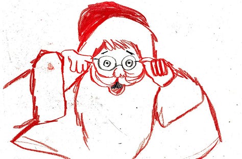
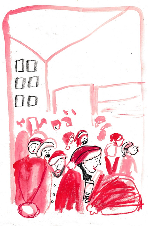
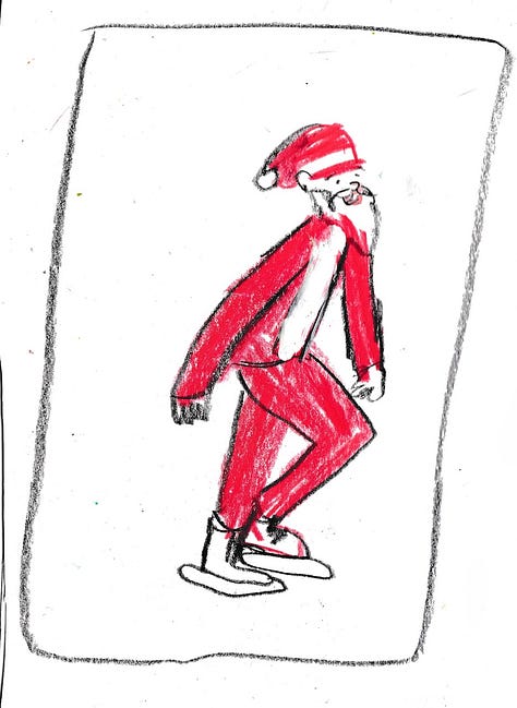
Of course, you don’t have to mute it. It was fun to use vermillion full throttle in our pop-up Santa Session with Charlotte Hamilton!
Prompts
Mix vermillion with other reds and pinks in your palette. My favorite was mixing it with watered-down ultramarine watercolor and fluorescent pink Posca marker!
Take notes of where you find vermillion in nature. Draw it!
Find an unfinished sketch and add some pops of vermillion to it. Does it look more finished now? I bet it’s getting closer! What would complete it?
Materials I love to use with vermillion

More color videos
In the video
A color mixing demo using warm primary colors
Choosing complementary colors to create harmonious palettes
Painting a festive snow globe illustration from an sketch


