


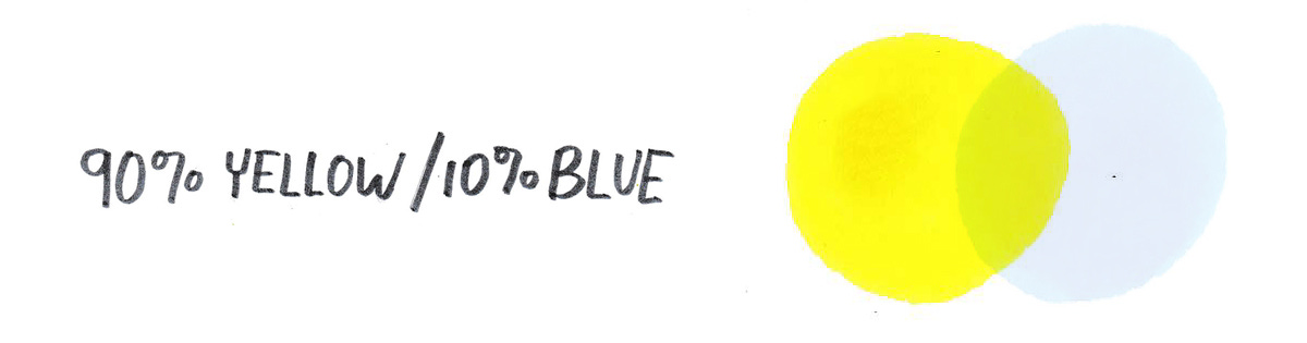
A simple mix of yellow and blue gives us this gorgeous greenish-yellow color.
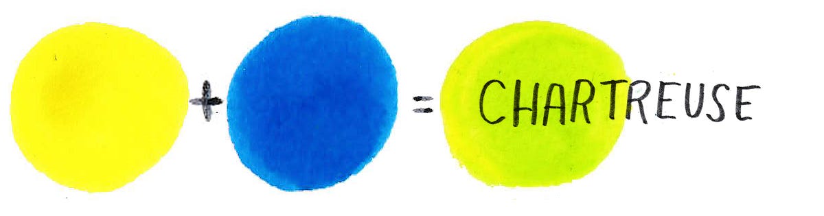
Remember to mix WAY more yellow than blue.
Chartreuse is a secondary color.
Since we only use two primary colors (yellow & blue) to mix chartreuse, the law of the almighty color wheel tells us it is a secondary color, like purple and green.
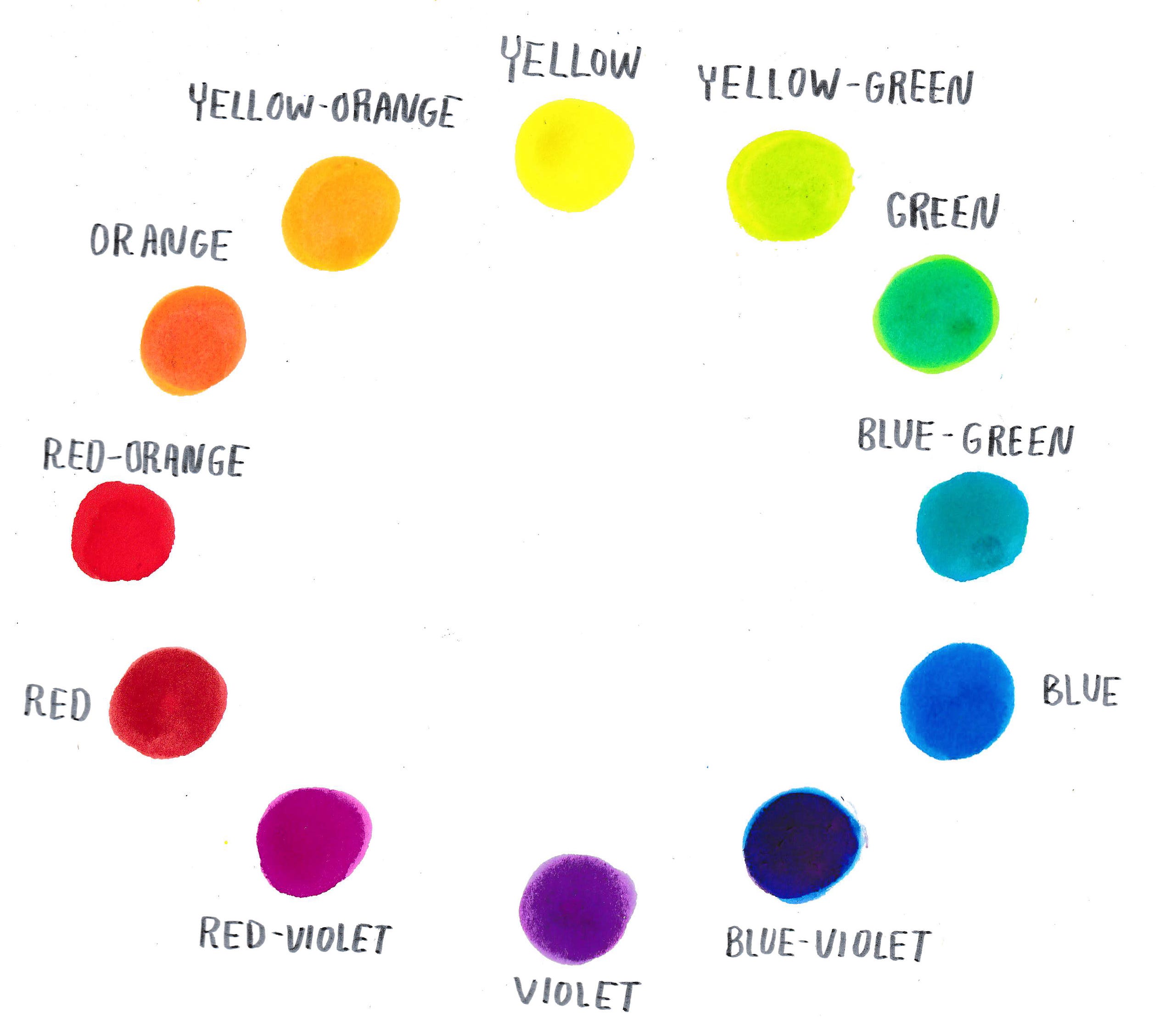
Its complementary color1 is red-violet, which means they pair well together, like chips and salsa!
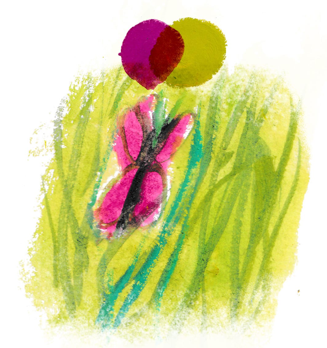
Chartreuse needs a friend.
Even though it’s a vibrant, punchy color, it’s not quite dark enough for details. I’ve had a nice time pairing it with indigo and reddish browns, so it’s able to shine in all its yellowy-green glory!

In the video
I share sketchbooks, process timelapse, materials I’m loving, artists using chartreuse masterfully, and real-life creative challenges. At the end, I go over a simple way to add your own handwritten text to your illustrations, which Carol Tyler kindly requested a few months back!

