That Silly Color Wheel
The color wheel is a brilliantly-designed visual tool, but let's ignore it completely and focus on temperature for a minute!
I'd be LION if I said it wasn't a genius tool for mixing harmonious palettes.
Recently, I shifted gears to focus on color temperature.
It’s a simpler concept: Primary colors are either cool or warm. All colors are possible from those hues.
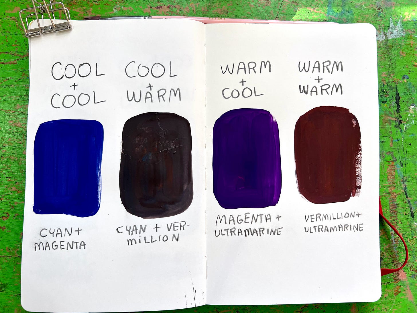
I wanted to familiarize myself with how the warm & cool primaries interact so I could avoid mixing palettes of mud.
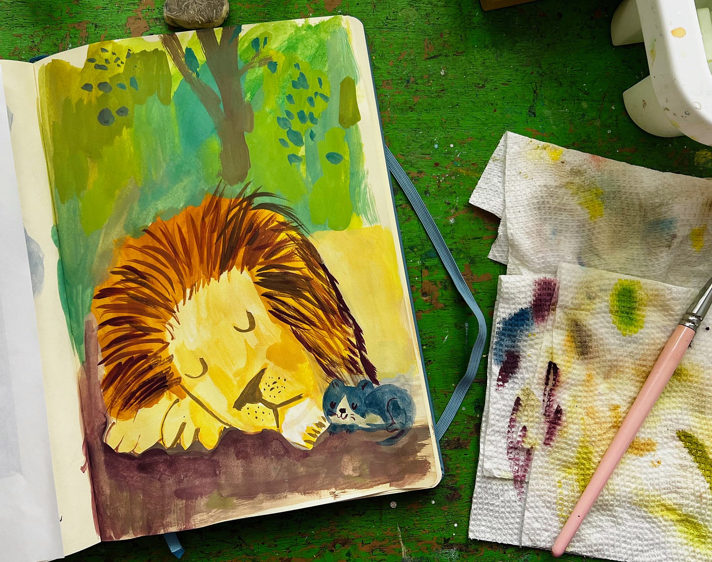
Then, I repeated the same drawing with warm primaries.
This illustration was painted in warm primaries: yellow, vermillion & ultramarine.
I’m not kitten around — color temperature is SO important! ✨
The color wheel tells us blue and red make purple. But note the difference in the swatches below. (Aside from one having a furry paw print, courtesy of a cat named Harmony. Don’t you just love irony?)
Renowned art instructor Betty Edwards notes in her book, Color,
“No reliable, readily available red is pure enough to mix well with yellow on one side of red (to make orange and red-orange) and blue on the other (to make violet and red-violet).”
All this to say, knowing how the warm and cool primaries interact together will save you a lot of paint and time later.
How do you know if a color is cool or warm?
Each color has a bias towards another on the wheel. If a yellow (like lemon yellow) is closer to green, it's cool. If it’s closer to yellow than it is to blue (like vermillion), it's warm. Ultramarine looks cool to me, but is actually warm!
An awareness of this is essential because your mixes can easily clash if you're not considering their temperatures.
How can this help you mix colors?
If you’re taking the color wheel at face value, I challenge you to give yourself some space from it and embrace color temperature! Letting go of the rigid rules of color theory is freeing!
More color resources:
Color Collector: Explore the Art of Color Mixing With Gouache
All Mixed Up: Fun with primary colors - I mix two cool primaries and a warm to paint a pride of lions
Below the paywall, you’ll find a demo of me mixing cool and warm primary colors to make different versions of the lion illustration at the top of the post!


