


It’s my pleasure to introduce Andrew James as a guest contributer this week!
How to make bold and clear colours, even if your paintbox looks like this.
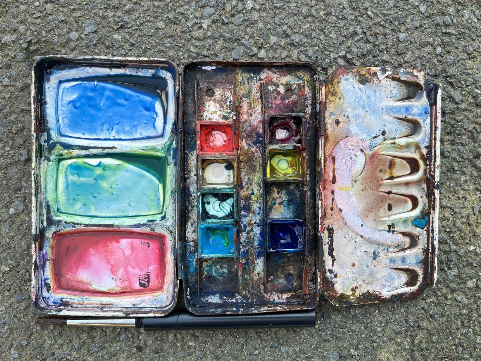
I get away with a feral, scungy palette because of the colours I choose, and how I choose them. Today, I’m going to show how to use a messy, limited watercolour palette to create clear and bold colours.
This is ok. I promise.
This post is long-ish and a little bit technical, so maybe make yourself a cup of coffee. I’ll still be here when you get back.

The case for simplicity
To me, it’s kind of wild that every colour derives from just red, yellow and blue. It seems like it shouldn’t work. Nothing else is like that. There aren’t “primary sounds”, and you can’t make every food out of “primary tastes”.
Using just three primary colours is a Very Good Plan. It does so much good:
Decision making is simple - you only have one kind of orange to use, red+yellow
* It ties the painting together. Everything is made of the same things so there are no weird spots where colours stand out, and stops you from making muddy colours. And if you use it throughout a sketchbook, it ties the whole book together.
* You learn faster. Keeping the same palette, you work out what the colours can and can’t do quickly.

Despite all this, companies still make ridiculous palettes with 48 colours. You don’t need them.
You won’t use them all anyway. It’s like a Chinese restaurant; even though the menu has 437 dishes, I get the same meal every time. Too much choice is overwhelming.
But the menu isn’t the palette. In the kitchen, a series of containers holds vegetables, proteins, and sauces. Maybe I was wrong before, and there are primary ingredients?
But.. there are different primary ingredients for different cuisines. A Chinese restaurant has no business with salami and cheese; too many primary ingredients spoil the menu..
It’s the same with paints. Zillions of colours give you decision fatigue and weird, mixed-up paintings, like the strange plates of food that happen at mega buffets.
So here’s how to simplify!
How I choose and use a limited watercolour palette
Choose your fighters:
You only need three. But which three? There are hundreds of colours.
The key is to learn to read the tubes: every tube of artist-quality watercolour paint, whatever the brand, will have an ingredients list. It tells you what kind of floaties are in the paint, with a pigment number.
For example, Payne's grey is already a mixture.
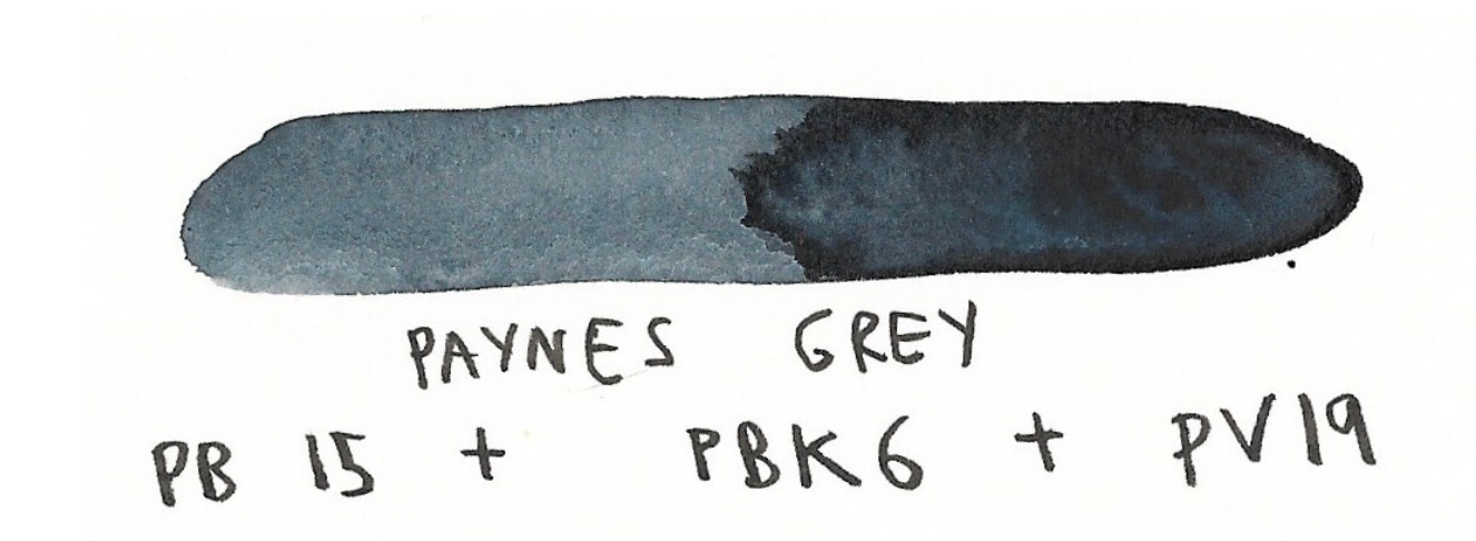
For each of these, the P means Pigment, the next letter means the colour, and the number is which colour.
PB15 = Pigment that is Blue, number 15.
It also has black and violet pigments in it too.
Remember being four years old, bunging all the paints together in one place and making mud? The more things you mix together, the muddier it gets, so I find single-pigment paints are a better choice for mixing.
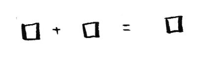
Another thing that matters to me is transparency, which some brands show with a square: colours with just the outline are transparent and colours with a filled-in square are opaque.
Finally, I want colours that are as saturated as possible. Bright and bold - you can always tone them down, but you can’t go the other way.
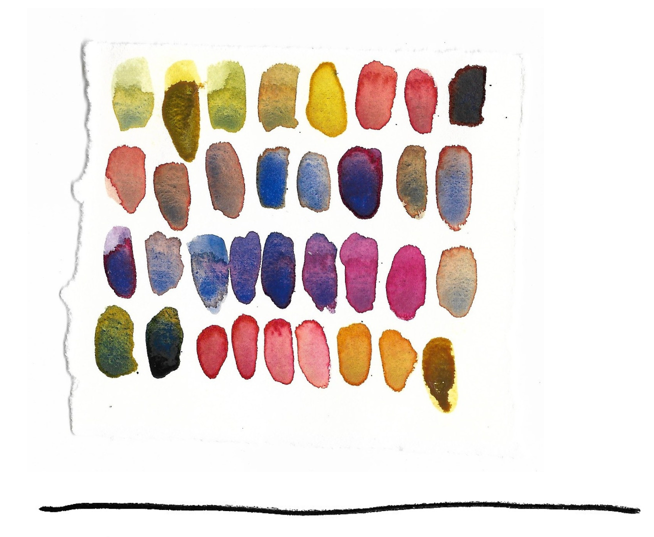
Looking for these three attributes, my main triad is :
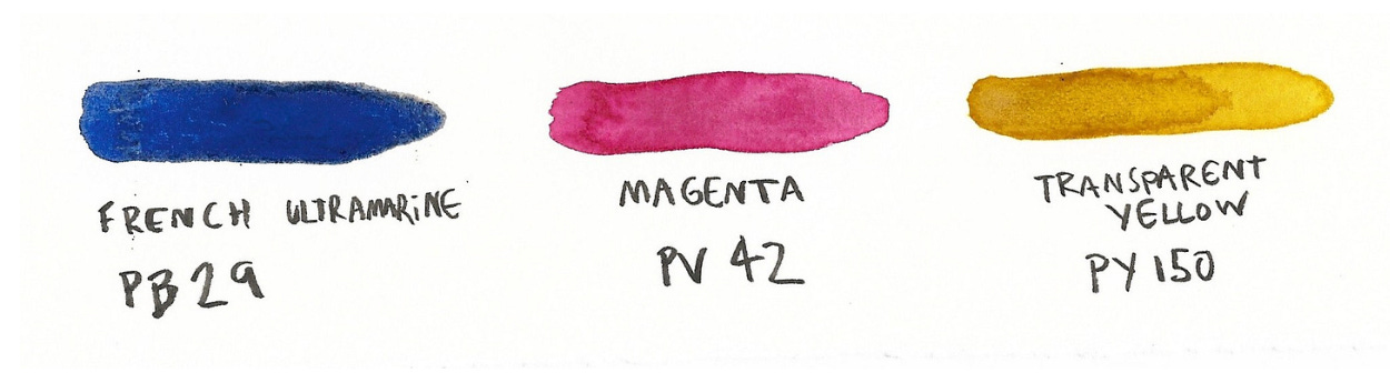
French ultramarine (PB29) Magenta (PV42) Transparent yellow (azo-nickel yellow) (PY150)
There are plenty of other triads that work. I mostly paint street scenes and urban environments. If you’re painting desert landscapes, you might prefer a different triad.
A triad is a system; the three colours work as a team. To see how the team interacts, make a triangle.
Make a triangle
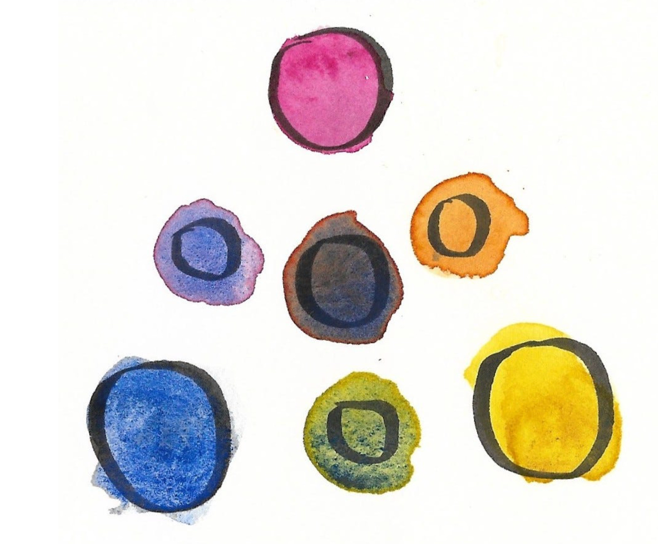
Everyone tells you to make your colours into a wheel, but I like to make a triangle.
Put the primaries in the corners, then mix them to get the secondaries in the middle. You can create in between colours too, and see the full range of colours that these three primaries can make.
The colour triangle acknowledges that there are colours beyond what you can make. You cannot mix Fluorescent Orange from these paints.
A different triad will make different colours possible. Not better or worse, but different.
When you make these triangles, you’ll work out what colours are possible. The triangle becomes a handy reference when you’re painting later on.
A word of warning. I don’t know of a “perfect” triad that does everything. My favourite triad is missing a good fire-engine red, but I am willing to sacrifice this because of the amazing purples that magenta makes. Whatever you choose, there will be tradeoffs.
Dance in the space
When I’m mixing colours with a triad like this, I think about where I am on a colour triangle, and where I want to go.
If you’re trying to make a colour, have your best guess, then test it on a scrap of paper. This helps because it’s hard to tell what a colour looks like in the palette.
If a colour is “wrong” you have only 4 options: add water, red, blue or yellow. Adding water will make it lighter, and adding a colour will move you toward that colour in the triangle.
If it’s too orange, add a little blue. If it’s too red, add some blue and yellow. If the purple is too purple, add yellow. A little practice and you’ll get it.
If there’s a colour that you need that you can’t make, just chill out. Matching the colours exactly doesn’t matter. If you’re in the right neighbourhood and the values are pretty close, the picture will work.
Thinking about colours by mapping it to where I am in a shape helps me organise my thoughts. Each colour is a point in space, instead of a vague “orangey dark brown”
Make your own black.
For me, the real test of a triad is how dark you can go. Watercolours are always diluted so you’re limited by your darkest paint. This is almost always your blue.
My normal recipe for black or a neutral colour is lots of blue, some red, and a bit of yellow. Once you’re there, you can push things around the colour triangle a little, and get some amazing neutral colours. Pushing toward blue to get greys, towards yellow and red to get browns. They all look way more interesting than tube blacks, which look dead and lifeless in comparison.
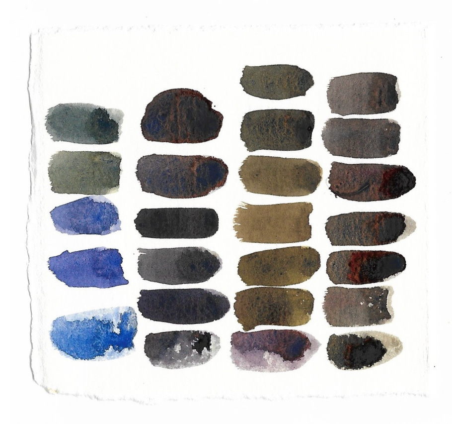
It’s hard to capture the beauty of homemade neutrals in a scan. They look even better in real life.
You can get the same kinds of variation in any colour. Look how beautiful and unified these colours look. They’re family.
Using transparent, single pigment primaries simplifies your approach, unifies your paintings, and as a bonus, it costs less, because you don’t need all those other colours. That’s more money for chocolate (or fancy paper, which is actually the most important piece of watercolour gear).
The even bigger bonus is you can be a gross gremlin like me and never have to clean your palette again. If you have opaque colours, they contaminate each other, and you’ve gotta be a bit cleaner to get bright colours. All the transparent colours work together, always. You’re just starting your dance in the colour triangle from a different spot.
Limit yourself. Turns out that restrictions are freedom
Happy painting. Make some triangles. I’d love to see them.
Andrew
P.S. You can also use a helper colour, but that can be a bit problematic and life is simpler without them. My helper colours are Prussian blue, cerulean blue, cadmium red light and raw sienna.
Be sure to visit Andrew at Coffee in drawings out and subscribe!
 | A guest post by
|
Really great post! I love working in limited palettes! I am however, the sucker who buys all the colors because I cannot help myself. 🤣
This was a wholesome post on primary colours! Andrew’s primary triangle seems to be something I’m finally getting!! Never was a big fan of the wheel 🫠 thanks Andrew and Beth for this! :)