If an illustration is a party, contrast is the food. It’s not the main reason people are there, but it’s important to get it right.
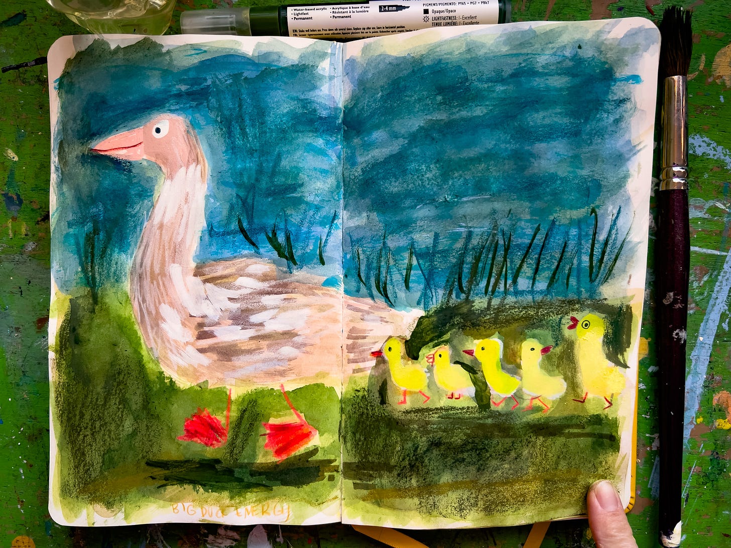
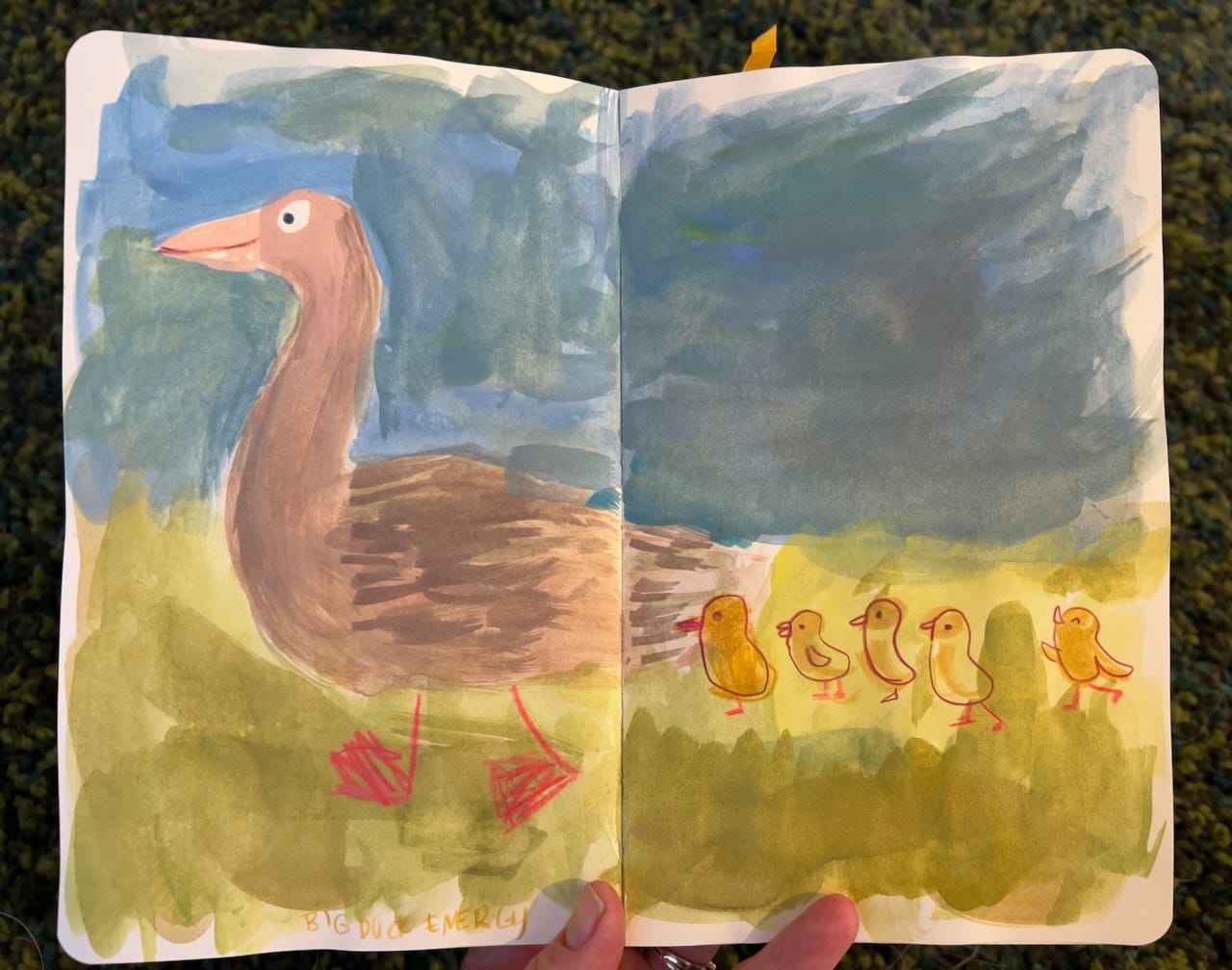
Unlike catering a party, we can figure out contrast while drawing our illustrations. Here’s an example of something I drew last month. I knew something didn’t look right, and it wasn’t just my lack of confidence in drawing ducks.
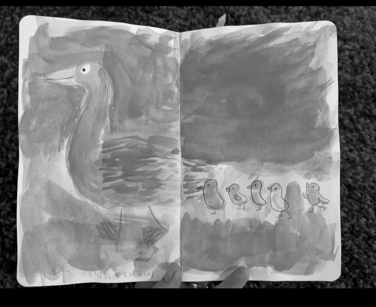
I snapped a photo and desaturated it in my phone’s photo editor.
See how the big duck in front seems to fade into the background? Now I can decide how to give this mama duck the contrast she needs to make her stand out. My instinct is to darken the background using a cool blue. Since I know cool colors recede, a nice teal background will bring Mama Duck into the spotlight!
How artists I like use contrast
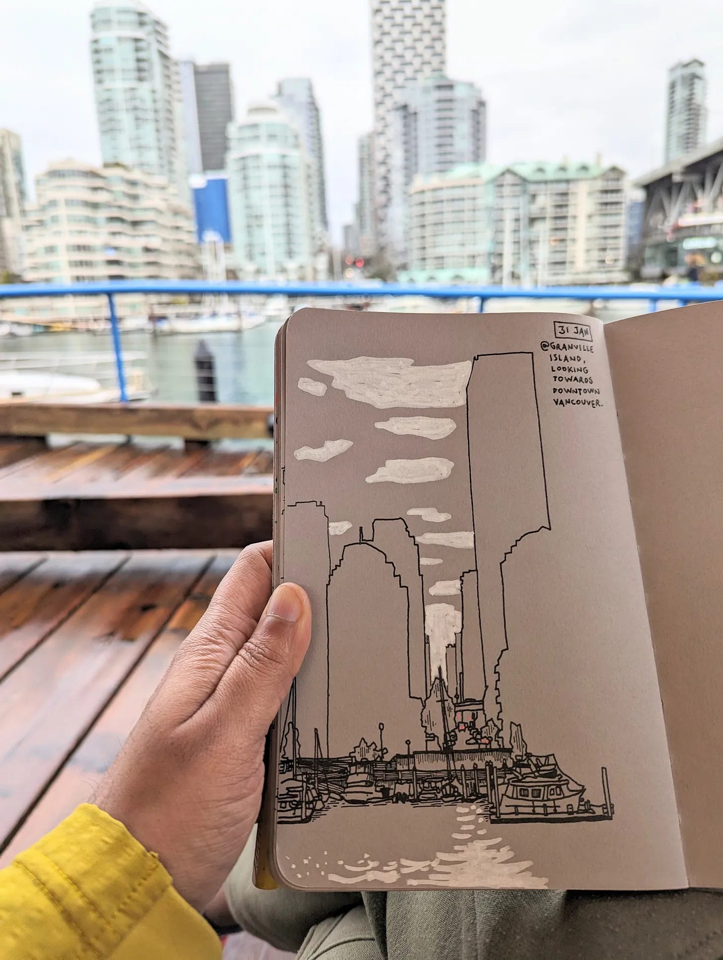
Nishant Jain uses a thicker line around important elements to tell the story in his work. Notice how he doesn’t even bother drawing windows, which is brilliant. This a perfect reminder to draw what you love and leave the rest!
With contrast on the brain, I asked Helen Stephens to give her two cents, and boy did she deliver! One of Helen’s superpowers is using contrast to tell a story in even the most complicated images. She shows us where to look in this spread from How to Hide a Lion, prompting us to turn the page and see what happens next. Enjoy below with a delightful audio sample from Helen herself.
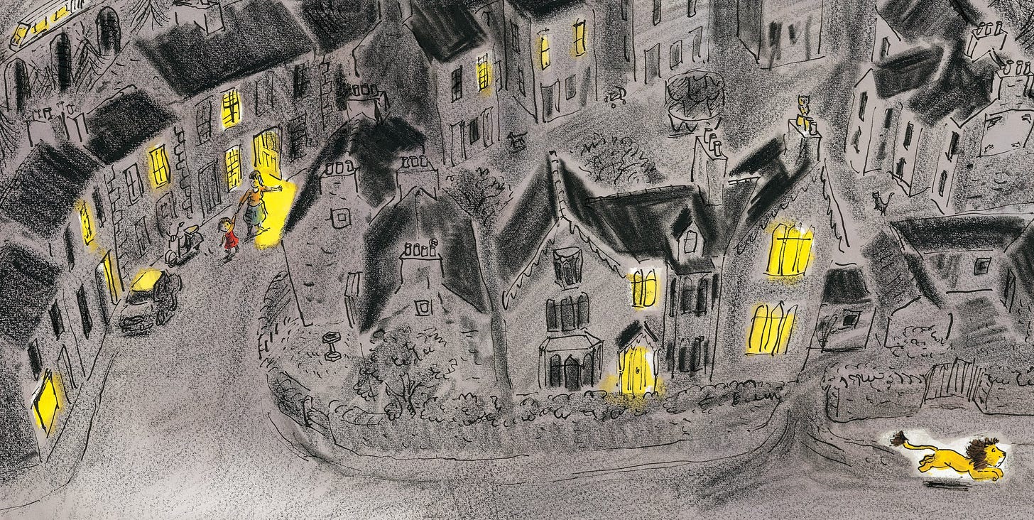
Contrast is like a GPS that actually gives you proper directions around an illustration.
Another trick for checking contrast
Blur your eyes or get up and move several feet away. If the important parts aren’t clear or fade into the background, give it some love in the form of contrast!
In the paid member video, I show how I use Procreate to play with lights and darks for some quick contrast experiments!
P.S. We have directory of all the paid-member things by category. Take a peek!
P.P.S. Did you know we have an Art Supply Swap Page, where you can trade your gently-used materials in for exciting new supplies?


